
ON ORANGE AND BLUE
It's interesting how some color schemes have such strong identities. When I look at each station and the combination of colored lines that pass through them, I will draw connection to random things..
For example, are you a Knicks or Mets fan? Two of my new prints happen to be blue and orange:


Actually, the West 4th Street station also has the same colors. Would make for a good color scheme of your room. Check them out along with a few other new prints in our shop page!
STATION FOOTPRINTS IN APPLE MAP
For the longest time, subway stations were represented by a singular symbol "M" on most map apps. I just realized recently that since iOS 9, apple map has been showing the footprints of the stations in faint pink, and individual exits in little orange dots, like in this screen shot:

Even though these are 2-D, this additional layer of information is in line with the goal of Project Subway NYC, which is to understand the subway stations not as a single point in space, but as part of a network that branches to various destinations in the city. So now if you have an iphone, you don't have to rely on MTA's neighborhood maps alone. Pretty neat, pretty neat!
CAN I DO THIS?
Since I launched this project last year, many people have asked me the same question: Can you actually do that? As in, can you just walk around in the subway stations and draw the layouts? I have to admit I only assumed it was okay, but in hindsight I shouldn't have assumed anything. So as I resume my drawing drill, let's take a moment to review the MTA's rules of conduct here:
As far as I can tell, there are only two sections that could potentially have something to do with surveying and drawing:
Section 1050.7 - Disorderly conduct
Can't find anything in this section; andSection 1050.9 - Restricted areas and activities
The only provision I find relevant is this:
(c) Photography, filming or video recording in any facility or conveyance is permitted except that ancillary equipment such as lights, reflectors or tripods may not be used. Members of the press holding valid identification issued by the New York City Police Department are hereby authorized to use necessary ancillary equipment. All photographic activity must be conducted in accordance with the provisions of this Part.
So, if I understood the rules correctly, as long as I do not use flash when I take my photos, and do not create any trouble, or cause any disturbance or interference to the operation of the train system, I should be fine.
This is a project I really want to continue to develop, and the last thing I want is to get into trouble. If you think I missed anything, please drop me a comment, thanks!
SUBWAY STATIONS IN VIDEO GAMES
I have been introduced to the world of video games recently, and I happen to know today is the big launch of this game called "Tom Clancy's The Division"- a game that takes place in a doomsdayesque / apocalyptic New York City. The game features a highly detailed NYC - streets, shops, landmarks... and subway stations! Here are some of the images and clips I found online:

(image source: http://www.gamepur.com/)
One of the video shows a "14th Street" station (not sure which one) and another one shows "Penn Station". I wonder how accurate they are - are they made up or did someone already go through the same exercise I did, scoping out every station? If they are accurate, maybe I can make my next batch of drawings by "surveying" inside this virtual reality...
THE NEXT STATIONS ARE...
Poll results for next batch of five
I'M BACK AND READY TO ROLL AGAIN
I went back to Hong Kong for Chinese New Year in the beginning of this month, and here is a picture of me standing next to the station map at Tai Wai, where I am from. It was interesting going back to where it all started, and I am even more convinced today that this project is worth pursuing.

Me next to the Tai Wai station map
My break from this project was longer than I thought it would be - but now that I am back in NYC, refreshed and energized, I am ready to start drawing again!
SEASON'S GREETINGS + THE SUBWAY MAP X'MAS TREE
As the holiday season approaches I decided to take a break from drawing (If you haven't voted though, please do so because I will most probably start drawing again in January).
Every year I try to find a creative way to make a Christmas tree, and this year there's no better theme than the subway theme, check it out:
Subway Map Origami Christmas Tree
Subway Map Origami Christmas Tree
If you want to make your own, you can follow these instructions:

Or you can watch this video too:
On behalf of Project Subway NYC, I wish everyone a year of much love, happiness, and not too many train delays. Happy holidays!
LET'S TAKE A VOTE (AGAIN)!
Which stations should I draw next?
LIKE US ON FACEBOOK!
Here is a sneak peek of the Fulton Street station print, which will be released soon. Like us on facebook for updates and more!

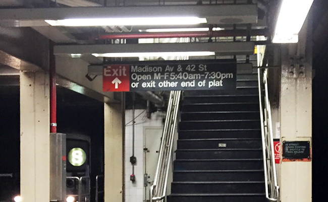
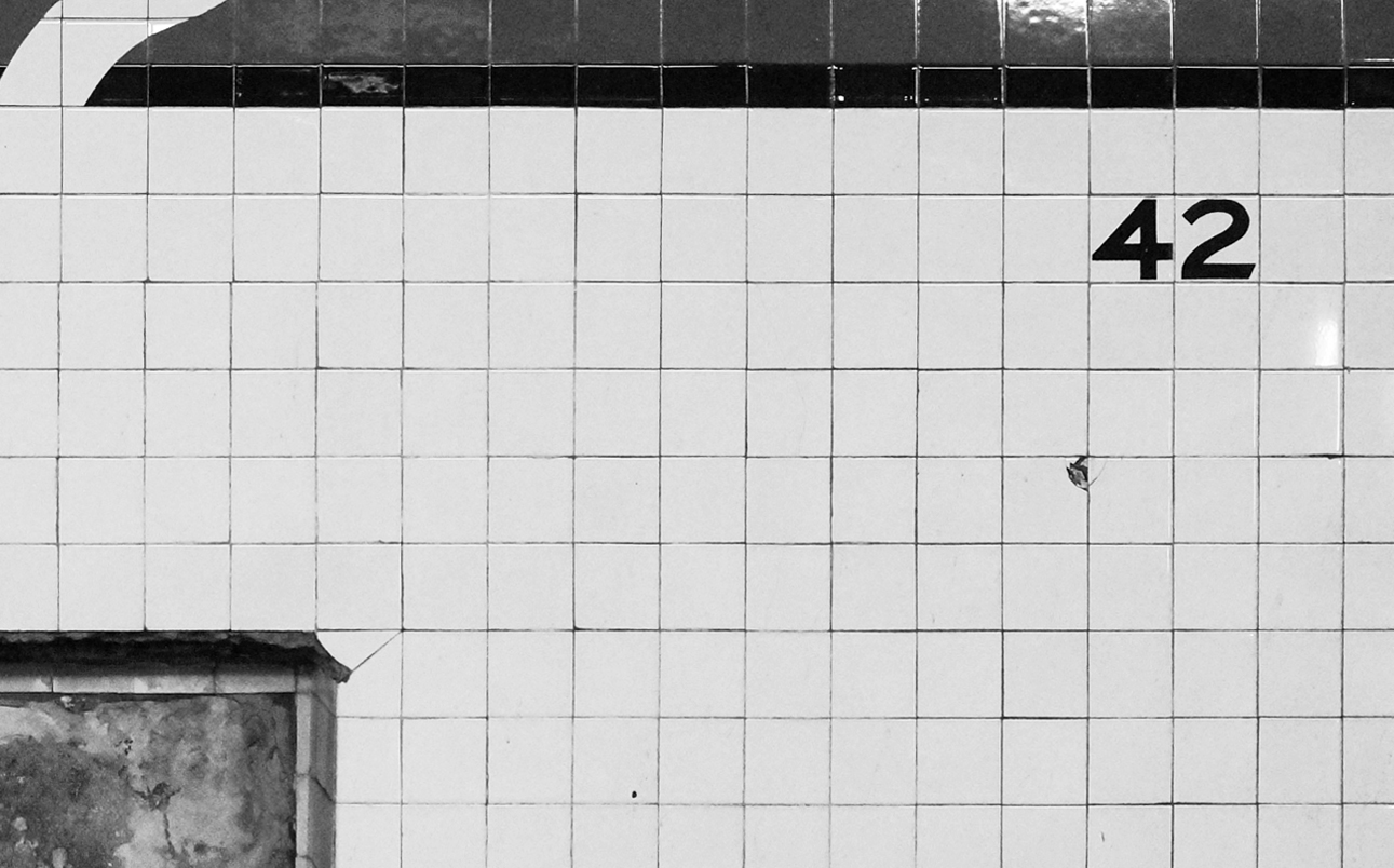
ALMOST THERE - 42nd street grand central
The subway may open 24 hours a day, but some of the exits do not! As I do research on the last station of my second batch at the 42nd Street Grand Central Station, I realize quite a few exits open to the inside of office buildings, and they only open on weekdays, during office hours:

42nd Street Grand Central Station Snapshot
42nd Street Grand Central Station Snapshot 2
Once I am done with Grand Central, the remaining tasks are organizing and formatting. My goal is to do my second launch - with 5 new images - on or before Cyber Monday, 30 Nov. Stay tuned!
UPDATED 7 TRAIN ARROWS IN POSTER #42
Since the 34th Street – Hudson Yards station was opened in September this year, I have updated my Times Square drawing to show 7 train running both ways!

Both arrows pointed to the right in the old version

WORK IN PROGRESS - LEXINGTON AVENUE - 59TH STREET
Coming back uptown, I tackled Lexington Avenue - 59th Street next. I mapped out the entrances in the first visit:

This is the kind of thing that kills all architects with pet peeves:
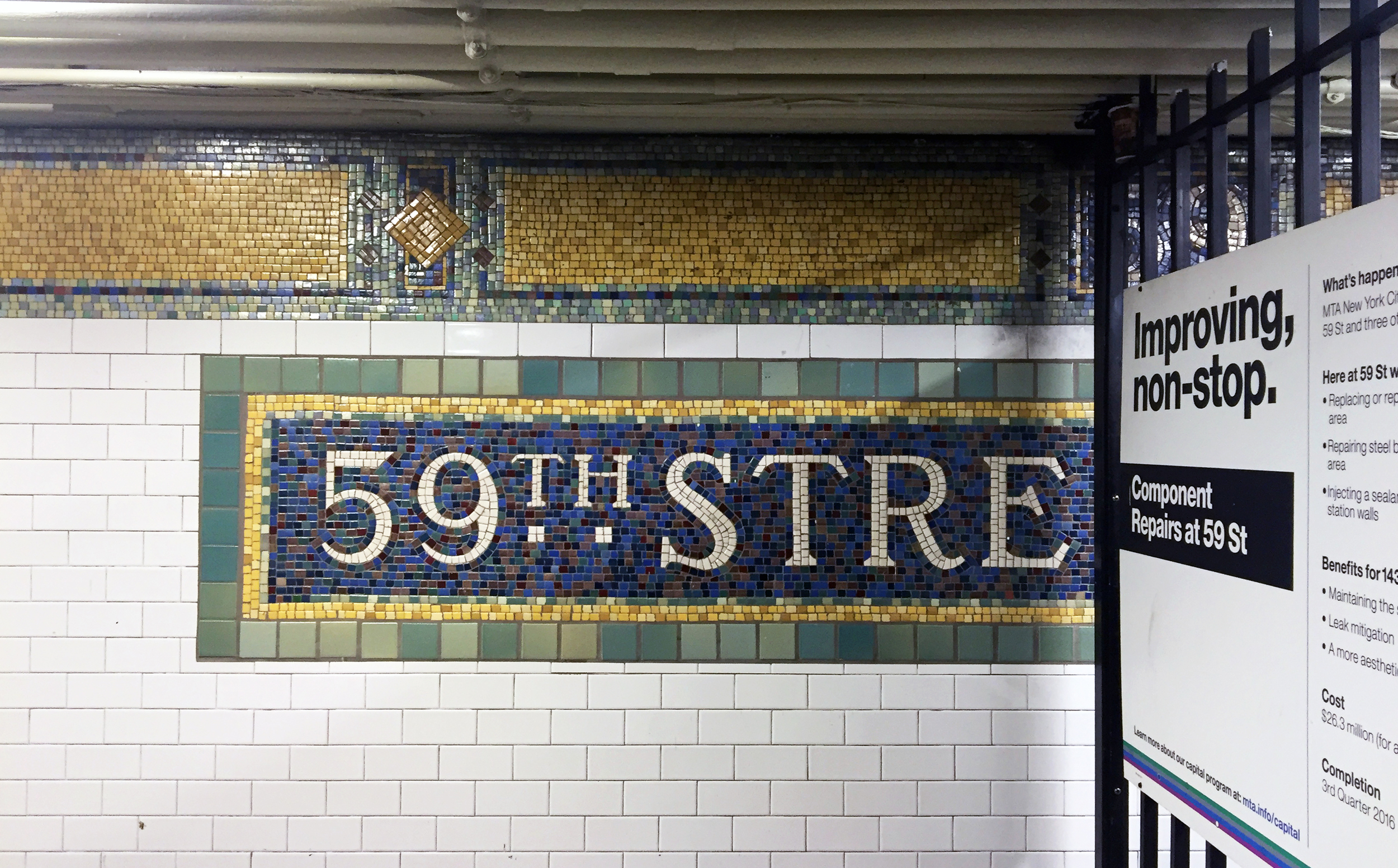
Lexington Avenue - 59th Street Snapshot
And I love this colorful Alice in Wonderland themed mezzanine!

Lexington Avenue - 59th Street Snapshot 2
WORK IN PROGRESS - CANAL STREET
Having picked up some fishballs from the supermarket and sipping bubble tea, I found myself in the Canal Street station.

Canal Street Station Sketch
See this part is so tight they have to put a railing to prevent people from walking straight into the track..
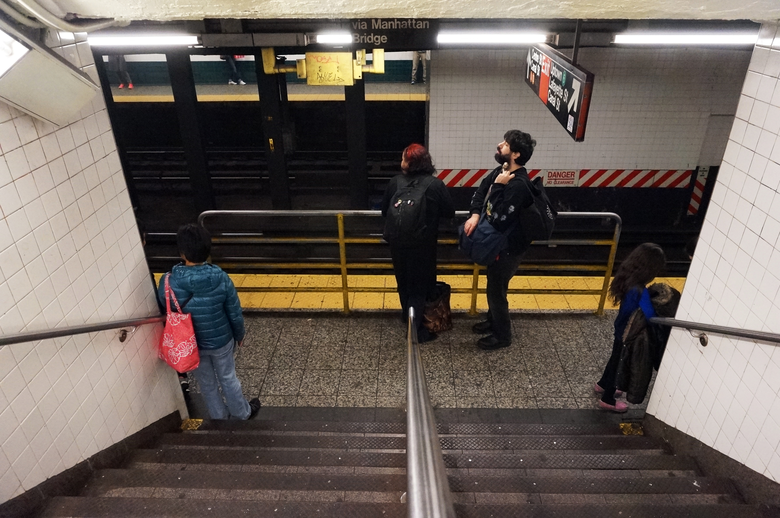
And there is this part of the station I have never been to, with this wall with funny symbols:

ON SUBWAY TILES
In an architecture office, the term "subway tile" is mostly used to describe a standard, white, rectangular tile that's 6" (wide) x 3" (high). As I take a closer look at the subway stations in the city, I realized the 4 3/8" x 4 3/8" square tile is just as, if not more common, than the 6 by 3 one. They look like this:

Here is their scale in relation to a person:
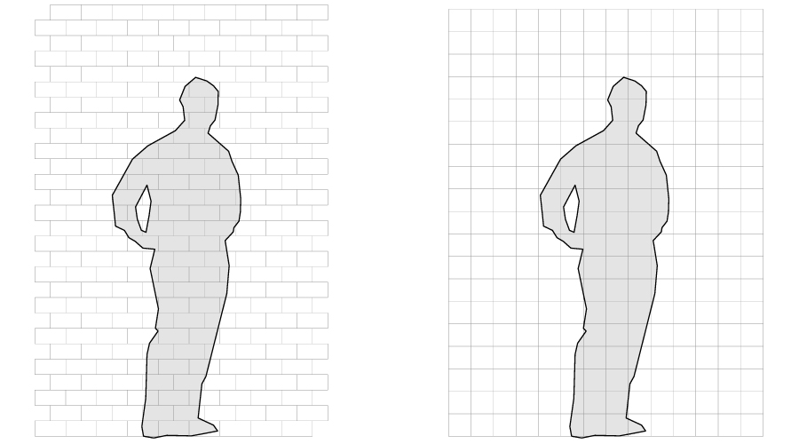
6" x 3" rectangular vs. 4 3/8" square subway tile
And in context:

6" x 3" subway tile in Columbus Circle Station
4 3/8" square subway tile in Times Square Station
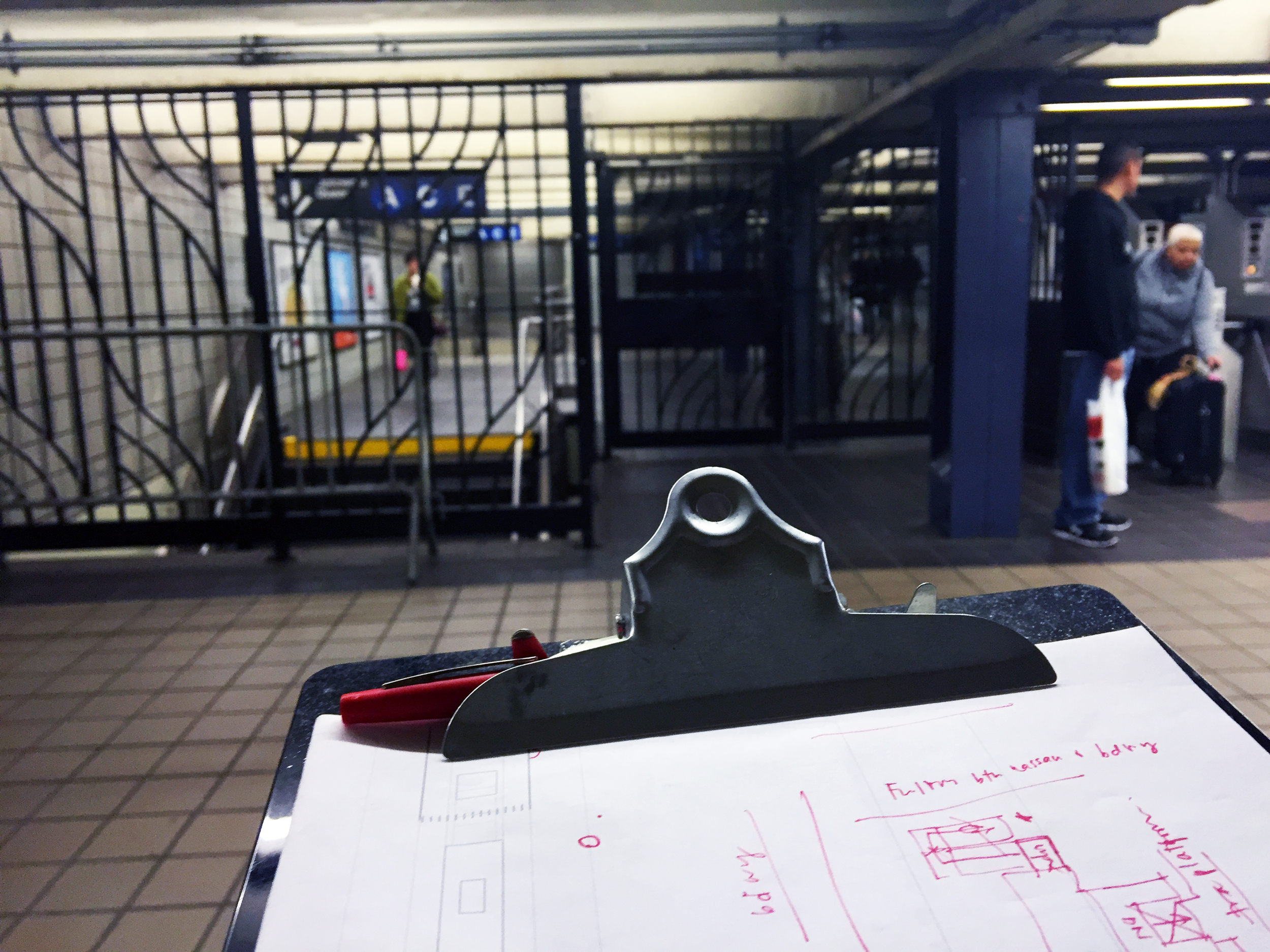
WORK IN PROGRESS - FULTON STREET STATION
This weekend I made it to the Fulton Street station. It was special to me because this is the station which inspired me to do this project in the very beginning. I no longer work in that area so it has been a while since I went down there... somehow it's even more complicated than I remember!
Snapshot from Mezzanine
Fulton Street Station Sketch 1
Fulton Street Station Sketch 2
And needless to say I have to go back...
ON SCALE
As people have noticed and pointed out, I exaggerated the heights in my axonometric drawings so things don't overlap (or at least overlap less). After looking at those drawings for a while I almost forgot I have the original computer models before I stretched them. They are far from precise, but just for fun I made a rendering of the Times Square station, with (relatively) correct proportions, and with human scale:
42nd Street Times Square
THEME SONG - DO YOU KNOW WHERE YOU'RE GOING TO? ♫
Can't call it a project until there is a theme song. Recently I came across the clip of Jimmy Fallon's Lip Sync Battle with Ellen DeGeneres, and I found the PERFECT song. To quote Ellen:
“...Diana Ross has a lot of upbeat, fun dancing songs, and this is not one of them. It’s a slower song, a very meaningful song that was written in the 70s before GPS or Google Maps, … it is a song, called “Do you know where you’re going to””
I guess I will be listening to this while I go scope out the stations from now on!
WEST 4TH STREET - AN "OFF"
Back to the drawing board, I was overwhelmed with the complex stations that I planned to draw... so I decided to pick one of the lower hanging fruits first. West 4th is a transfer station, but the station is straight, so i thought it's a good one for me to get back to drawing mode.
West 4th Street station - an "Off"
One interesting thing I noticed about West 4th, is that there is no exits on 4th street!! I don't know on top of my head, but I am almost sure West 4th is not the only station like this. After "Split", I would like to coin another term here:
OFF
noun
- A subway station in NYC which doesn't have an entrance or exit on the street it is named after.
ON COLORS
I have to admit, I have been designing my prints literally with "double standards". For fonts, I stuck to Helvetica because it's the MTA standard, but for colors, I tweaked them a little to make them my own:

Part of this comes from the graphic design class I took with professor Gavin Cooper, where he told us how primary colors tend to remind people of corporate logos - primary red and yellow will remind people of a certain fast food chain, and primary green, a coffee shop. And so I tried to push the colors a little off the original MTA pantones.
I don't think I am the only one who thinks like this. For example, I do enjoy the colors of these prints found on the design boom shop, by SuperWarmRed:

On a side note, not until I made this comparison graphic did I realized the letters N, Q and R in MTA standard are black because they are against a yellow background - a relatively light color. But I decided to keep the ones on my prints white, sacrificing a little bit of legibility for consistency's sake.